Featured Articles
- 12 Innovative Guerrilla Marketing Tactics to Explode Your Brand Visibility Without Breaking the Bank
- How Sensory Branding Taps Smells and Sounds to Forge Deeper Emotional Bonds with Customers
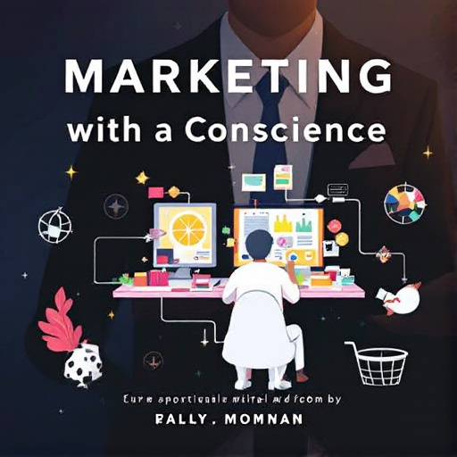
- Marketing with a Conscience: How Brands are Embracing Ethical Dilemmas to Drive Consumer Loyalty
- The Rise of Eco-Conscious Branding: Turning Green Ethics into Marketing Gold
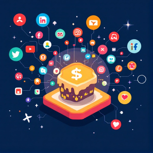
- The Surprising Role of Memes in Shaping Modern Brand Strategies: A New Frontier in Business Marketing
The Unseen Power of Color Psychology in B2B Marketing: Captivating Clients with Hues and Cues
The Unseen Power of Color Psychology in B2B Marketing: Captivating Clients with Hues and Cues
The world of B2B marketing is not merely about numbers and statistics; it is also deeply intertwined with the power of perception, primarily influenced by color. Understanding color psychology can elevate marketing strategies, captivating clients and enhancing brand loyalty in ways we often take for granted.
The Basics of Color Psychology
Color psychology studies how colors impact human behavior and emotions. A branch of behavioral psychology, it reveals that colors can influence mood, perception, and even consumer behavior. For instance, research shows that 93% of consumers make purchasing decisions based on visual appearance, and 85% cite color as a primary reason for their decision (Source: Color Communication in Marketing). So, what does this mean for B2B marketing?
Colors and Their Meanings
Red: Often associated with urgency, red can incite feelings of excitement and energy. It's a powerful choice for promotions and calls to action.
Blue: This color exudes trust and reliability, which is crucial in B2B settings where long-term relationships matter. Many financial institutions use blue to evoke a sense of security.
Green: Symbolizing growth and health, green is a favorite in environmental and health-related B2B services. It resonates with industries aiming to promote sustainable solutions.
Case Study: IBM
Consider IBM, a brand that has expertly used blue to forge its identity. The company’s use of this color has consistently communicated reliability in technology solutions, helping it become a trusted name in the industry.
Real-world Applications of Color Psychology
One of the best practices in B2B marketing is aligning your color scheme with the emotions you want to evoke. Understand your target audience and what they value. Are you marketing to tech-savvy millennials or traditional business leaders? Each group may respond differently to color cues.
The Unexpected Influence of Color on Brand Perception
Imagine walking into a conference room where the walls are painted a vibrant orange. You might feel energetic and ready to brainstorm. Alternatively, a room adorned in muted beige could lead you to dreamy daydreams or even mild lethargy. The emotions that colors evoke extend beyond personal spaces; they infiltrate businesses, affecting everything from product design to corporate branding.
Examples of Effective Color Utilization
Take a look at a few logos: The green of Starbucks signifies its commitment to ethical sourcing, while the red of McDonald's is known for stimulating appetite and evoking a sense of urgency. This shows that thought-provoking colors can drive marketing decisions even in B2B contexts.
Another fantastic example is Cisco, which utilizes blue extensively in its branding. The color not only enhances its image of reliability but also fosters a sense of calm amidst the often stressful world of technology.
Statistics that Matter
According to a study by the Institute for Color Research, color can increase brand recognition by up to 80%. That’s a massive increase for something as simple as choosing the right hue. Moreover, 52% of consumers avoid doing business with a brand if they don’t like its visual identity (Source: The Logo Company).
Color Context Matters
The effectiveness of color can differ based on context. For instance, while purple suggests luxury in B2C marketing, in B2B, it might convey mystery or creativity—qualities that can either attract or repel potential clients based on their needs. Keith Adams, a 45-year-old B2B marketer, comments: “In the world of tech startups, we often lean toward vibrant colors to draw in our millennial clients, but we stay grounded with a blue undertone to keep traditional investors engaged.”
Testing and Optimizing Color Choices
In B2B marketing, conducting A/B tests can help marketers find out which color schemes lead to higher engagement rates. Tools like Google Optimize allow businesses to run tests that highlight how different colors impact user interaction. For instance, changing a call-to-action button from green to red could vary click rates significantly.
The Role of Cultural Differences in Color Perception
Different cultures ascribe varying meanings to colors. For example, while white symbolizes purity in Western nations, it might connote mourning in some Eastern cultures. Marketers need to be context-sensitive when targeting global audiences; understanding the cultural implications of color can lead to more effective campaigns.
At a recent marketing conference, Sarah Lee, a 29-year-old marketing director, shared her experience. “When we launched our software in Asia, we completely reshaped our color palette based on local preferences. The results were staggering—20% higher conversion rates in the first quarter alone.”
How to Effectively Choose Your Brand Colors
1. **Know Your Audience:** Different target demographics resonate with different colors.
2. **Context Matters:** Factor in where your brand will be predominantly showcased.
3. **Stay Consistent:** Maintain a cohesive look across your marketing materials.
4. **Test, Test, Test:** Use A/B testing to see what works best.
A Little Humor Goes a Long Way
Picture this: A tech company decides to use highlighter-yellow as its primary color for marketing emails. Sure, it’s eye-catching, but clients might feel like they’re being yelled at. Keeping a sense of humor about color choices can also go a long way. Don’t be afraid to make fun of over-the-top color schemes as you refine your branding!
Closing Thoughts
The unseen power of color psychology is undeniable in the realm of B2B marketing. It’s not just about creating a pretty design but strategically choosing colors that resonate with your audience and enhance brand perception. Marketers who embrace this knowledge can differentiate themselves and create a compelling visual identity that captivates clients and drives engagement.
Remember that each hue carries the potential to tell your brand's story; be intentional about how you use it. After all, in the colorful landscape of B2B marketing, your brand isn’t just what you sell. It’s what you convey through every shade, tone, and nuance that you present to the world.
Related Articles